Wednesday 21 July 2010

Research: Aspect Ratios

So I have just been looking about lately, and one thing that has interested me are the different aspect ratios that films are shot in. There are the obvious aspect ratios of 4:3, and then the wide-screen 16:9 that TVs are produced in, but a good many films are shot in a wider aspect ratio than either of these two. So I thought I would look into the development of aspect ratios throughout cinema.

An aspect ratio is the ratio of the images long side in ratio to it's short side, expressed as X:Y or X x Y where X represents the width, and Y the height. The motion picture industry convention however assigns the height a value of 1.0, and so films are often described in the form of 1.33:1 rather than 4:3.

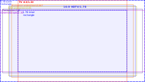
4:3 was the original standard for televisions, because it meant that films previously photographed on film were compatible with the television format. 4:3 just so happened to be the aspect ratio that best suited the medium of 35mm once sound once also captured on the film. This standard was maintained through televisions development, up until the fairly modern day, when wide-screen was introduced. It originally started off as 5:3, but was adjusted to 16:9 when Dr. Kern H. Powers discovered that if he drew out all the other aspect ratios commonly in use across both film and television and made them all of equal area, the resulting frames all fitted perfectly inside a rectangle of ratio 16:9, and said rectangle also fitted perfectly inside all aspect ratios. (see below)


So despite these being the two main aspect ratios for television broadcast, the motion picture industry looked beyond this and began to create their own aspect ratios. Because the television bought the moving images into people's own homes, the cinemas were looking at a massive decline in business, so the industry saw the development of new aspect ratios as a way to set themselves apart from the television broadcasts.

Common wider aspect ratios within the film industry are 1.85:1 (just a bit wider than wide-screen at 1.78:1) and 2.39:1 which developed from the original aspect ratio of 2.35:1, commercially branded as cinemascope or panavision.

These wider formats are often shot with something called anamorphic lenses. These compress a wide image into the usual recording area of a film, and then in playback, the opposite lens is used to re-stretch the image back out to it's original shape. If done digitally, this is done by just stretching the pixels from squares into rectangles. If the image were not re-stretched, everything within the frame would appear tall and thin.

To me 2.39:1 is an excellent aspect ratio to view films in. Although we are not aware of it, naturally our field of view is fairly wide, and not particularly tall, and I believe this 2.39:1 is much closer to how we see the world. I have started to try and frame my footage for the 2.39:1 aspect ratio, and will try to do so throughout this course.

Sources:


Tuesday 13 July 2010

Project 10: Sound (production)

Next I had to rerecord the sound for my production (the alcoholic) in project 3. The updated video is below:


I made sure the lid dropping on the floor was the loudest sound as this is what was meant to spark the reaction. I think it works well recording all the sounds at a different time to the actual video, as it allows fine tuning over each individual sound volume, and placement. Each sound is much crisper and clearer as well by having a dedicated recording of each. The atmos. track certainly makes a difference as well, although it is not really noticeable in this recording, when I played through the video on my editor with the atmos. track muted, it's absence was quite obvious, and the whole scene felt odd.

Project 10: Sound

The sound of silence:

Listening in my bedroom I can hear a variety of sounds. I can hear the sound of numerous birds outside my window, the sound of my computers fan whirring, the sound of my computer's hard drive, the sound of distant traffic. This is all what I would consider a quiet location, but all these sounds are helping to make up the atmosphere of this room.

Sounds in Project 3: (The Alcoholic)

In project 3 I recorded the sounds of what I was doing live. This exercise involved listing all the things within the scene that would make a sound. My list is below:

- Picking up the bottle
- Undoing the lid
- Dropping the lid on the floor
- Putting the bottle on the table
- Moving the glass
- Picking up the bottle
- Pouring the wine
- Putting the bottle down

This is a fair number of sounds in a simple 1 minute long clip.

The next task was to describe each sound. This wasn't very easy to do for me, as it's hard to put some sounds into words. My attempts are below:

Picking up the bottle: Crisp, short sound. Kind of clunky
Undoing the lid: Long drawn out sound. Slight scrape type sound. A kind of sharp sound
Dropping the lid on the floor: Short sharp sound followed by a longer drawn out rolling kind of sound
Putting the bottle on the table: Short clunky sound
Moving the glass: shortish scrapy sound followed by a clink or two
Picking up the bottle: Clunky sound with a couple of clinks
Pouring the wine: Longish rolling, swishing, flowing sound, gradually slowing
Putting the bottle down: Short Clunky Sound

Monday 12 July 2010

Project 9: Production - creating a feeling

For this production exercise I filmed two short scenes, one about a depressed man alone at home, and the second about a stalker arriving. For the first I wanted to create a downbeat, dark atmosphere to help portray the depression of the man. For the second I wanted to go for a bit of a mysterious feel to the scene, and a scene that created a bit of tension. My two scenes are in the video below


The first scene was shot using mainly light sources within the scene, the computer screen to light the face when sitting at the computer, a small amount of natural light creeping through the window to act as a small amount of fill light and lighting the room. I also used an extra fill light by the bed to light this area when the actor was reading the paper. I went for a slightly unsaturated look, to emphasise the feeling of depression, and the large areas of darkness throughout the scene I hope also portrayed this.

The second scene was shot on an overcast day, and I used a trick I had learnt to make it appear like evening (underexpose the image by a couple of stops, and set the white balance to tungsten, then desaturate and correct the colour a bit in post production). This not only created the look of evening, but also created a frame with a lot of dark, masking a lot of the detail, creating a bit of tension and mystery about the frame.

If I had more lights to use, I would have lit the first scene much more, and had more control over the lighting. I had to work at a fairly high ISO as I had cut most of the light out of the room, in order to control it better, but if I had more lights I would have added more fill light to the room to balance out the light and dark a bit better, and remove some of the shadows on the back wall. I would certainly keep the strong contrast between the light and the dark side of the actors face though.

The second scene I'm not sure I would have shot much differently. I might have shot it at night with some lights to light the scene a bit, but I am satisfied with the look I achieved. Overall as well I would have used some gels on my lights to balance the temperature better, as I couldn't use tungsten lights in with the lights in the first scene as the colour temperatures were different.

Lighting is key to a production. Good lighting often sets apart a big budget production from an amateur production. Control of lighting certainly helps create a mood to a scene, and can give a sense of a location or a time of day or something similar.

Saturday 10 July 2010

Project 9: light and colour

This project was to look at using different materials to bounce light back into a subject and see what effects can be created. Luckily for photography I have lots of different coloured card so I largely used this to see the different effect colour had.
This image above was with no reflection. There was a little bit of reflected light back on the left hand side of the picture from the wall behind. Firstly I went for a black piece of card to remove this fill:
It's quite clear this black card has darkened the left of the image as we look at it by preventing any light bouncing back from this side. I then replaced this with a white bit of card:
This produced a much softer image with more even spread of light across the face, but still allowing enough of a shadow to mould the face slightly. I then tried a piece of foil, on the slightly less reflective side:
This has created a much more even spread of light, and apart from the harsh shadow on the nose, there is very little shadow to mould the face. I tried some different coloured cards next:
There is quite clearly a colour cast thrown in each of these images. The yellow gives quite a weird look, but if it was replaced with orange I could see it being quite useful to warm up the shadows. The blue is an interesting effect, and looks quite natural actually, producing quite a cold looking shadow. The red warms up the shadow, maybe a bit too much, but may give the impression of some emergency light about combined with the right lighting effects.

It is amazing how much you can change the look of an image just by using simple objects to bounce light into shadows. I can certainly see the use of some of the coloured effects, and definitely the white card to create much softer shadows. I even experimented with the shiny side of the foil, and when moved right, could create the effect of the reflection of water ripples moving across the face, which shows how an everyday object can be used to simulate certain locations in an image.